DECONSTRUCION
We Identified severe inconsistencies.
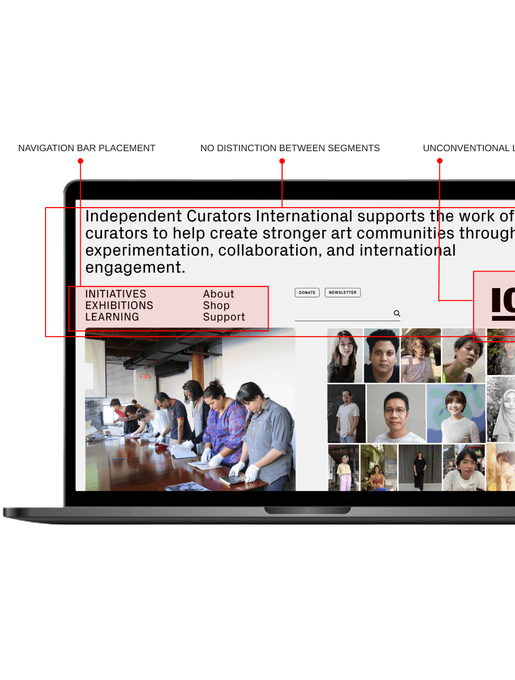
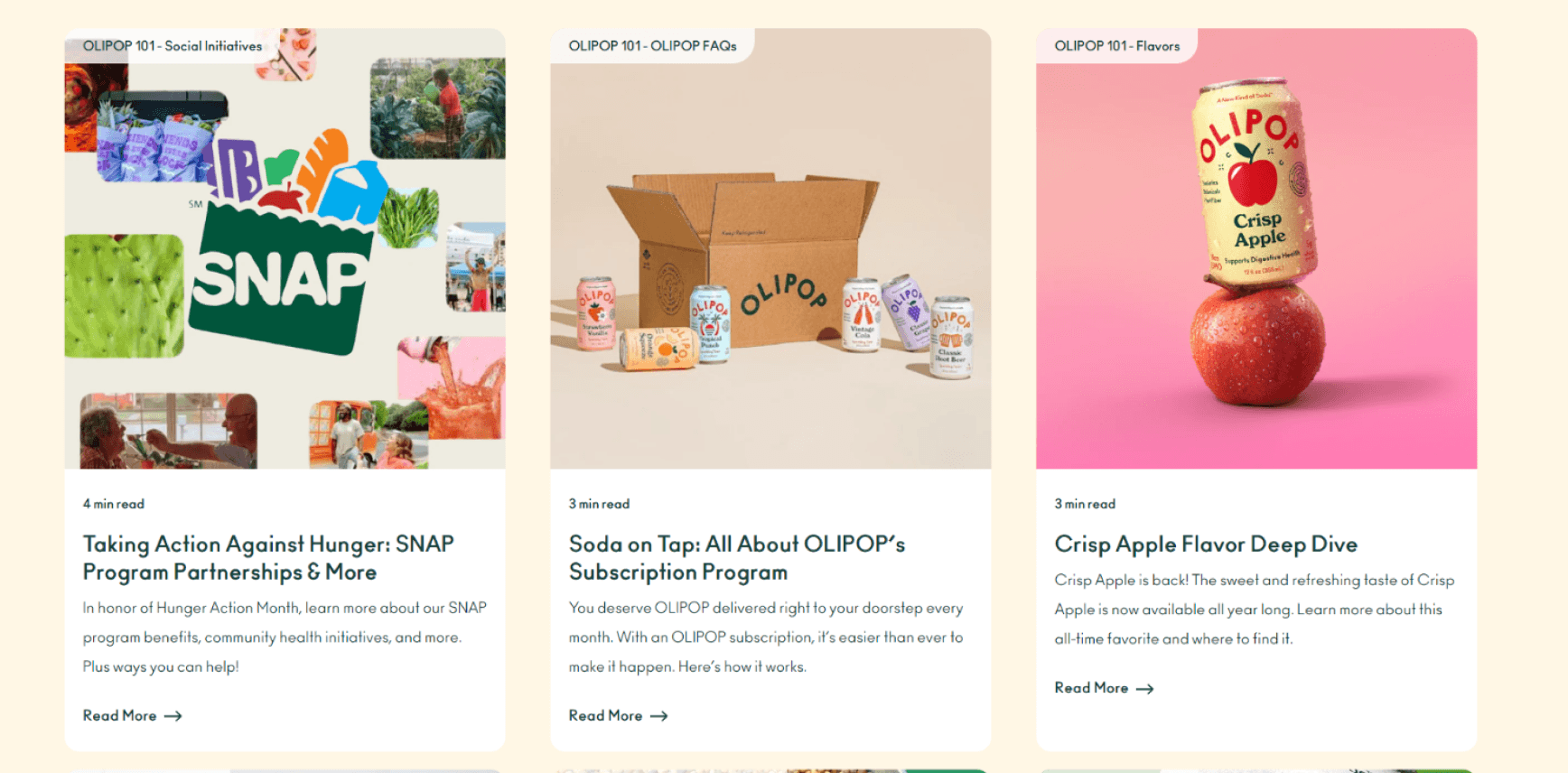
One problem is the lack of a visual consistency that connects different pages and parts of the site. We also noticed a bloated inventory with several variations in color and text styles which reduces visual cohesion.
78
Color Styles
28
Text Styles
17
Button Styles
OUR SOLUTION
Introducing
Fizz Design System
DESIGN PRINCIPLES
Establishing our Values
We established a set of guiding principles for helping us move forward with the design system. Aligning these values with Olipop’s branding ensured our design system would deliver both style and substance.

Fun
Surprise and delight users to make interactions joyful and memorable.
Simple
Focus on what matters most with a strong foundation and consistency.
Friendly
Convey welcome and inclusivity to explore and engage with ease.
BUILDING A SYSTEM
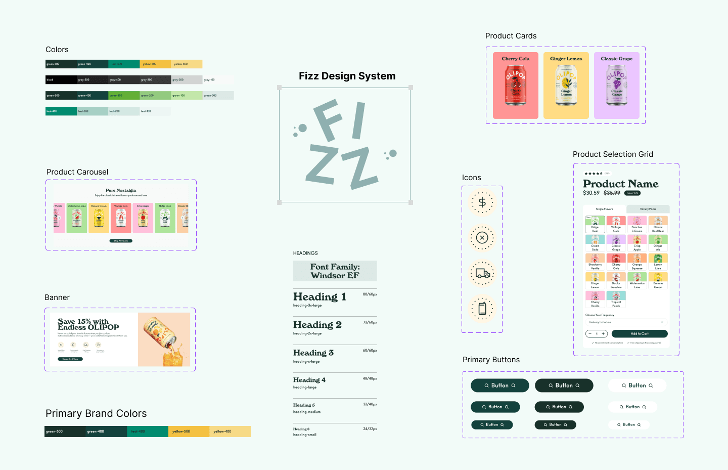
Building the Fizz Design System.
The design system follow Brand Frost’s Atomic Design methodology, which breaks down the system into atoms, molecules and organisms while the product is comprised of pages and templates.
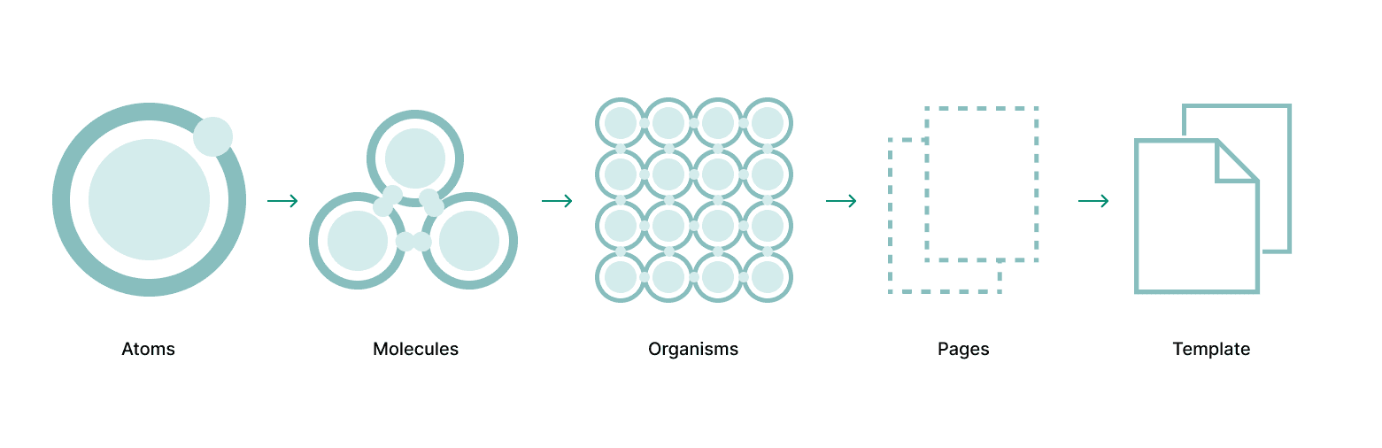
BUILDING A SYSTEM // ATOMS
Laying the foundation.
The foundational design styles forms the building bocks of Fizz Design System. By introducing a concrete framework, comprising of a layout grid, spacing, radius, icons, color and typography style minimizes the need for guesswork and improves efficiency. Semantic level tokens also facilitates seamless collaboration between designers and engineers.

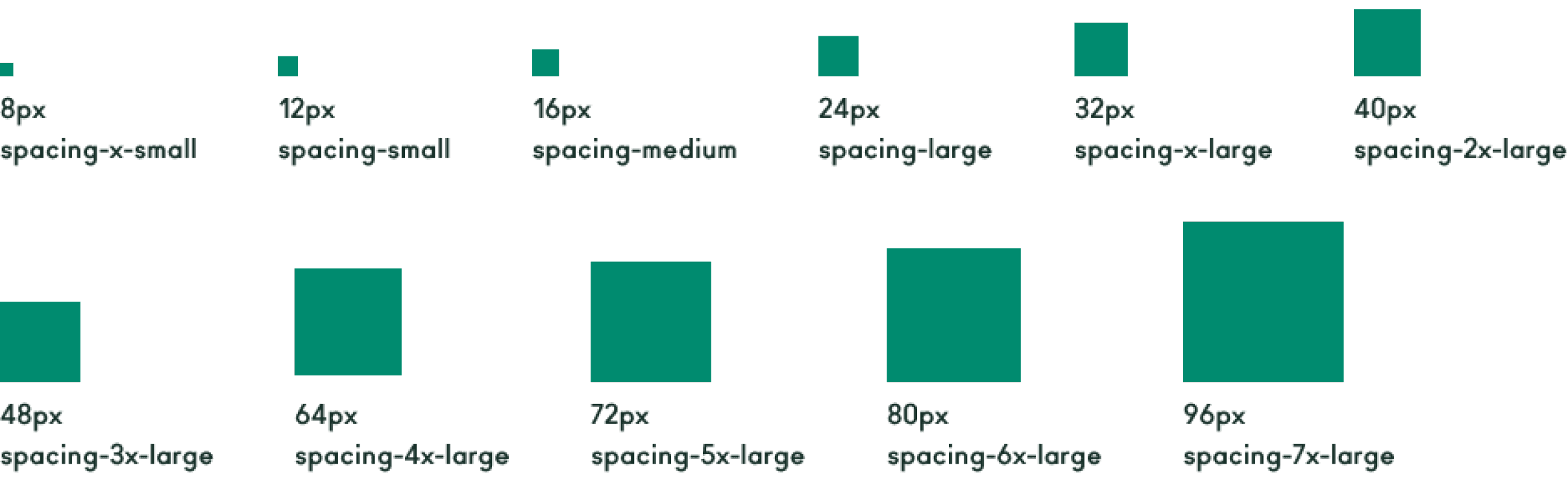
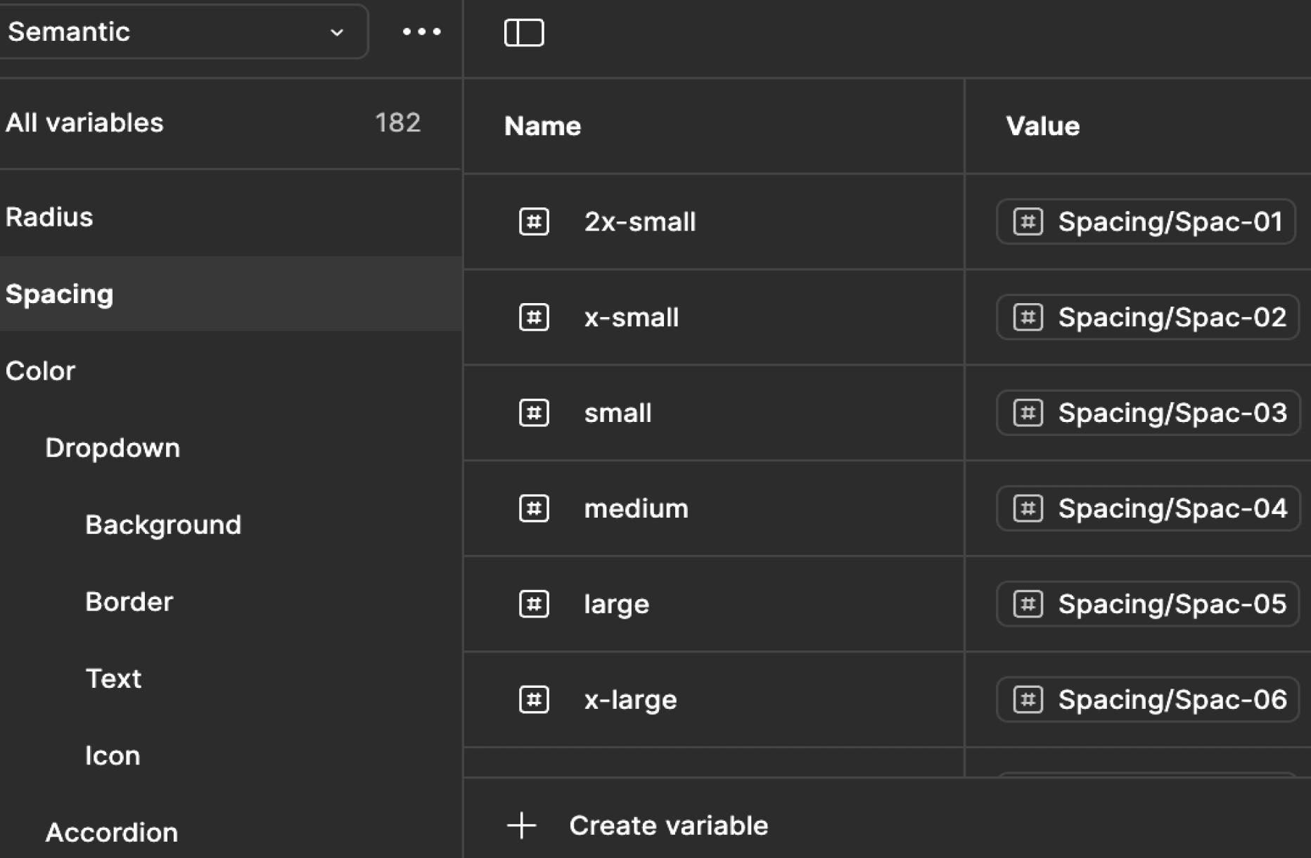
Spacing Variables.
Radius Variables.
Icons.
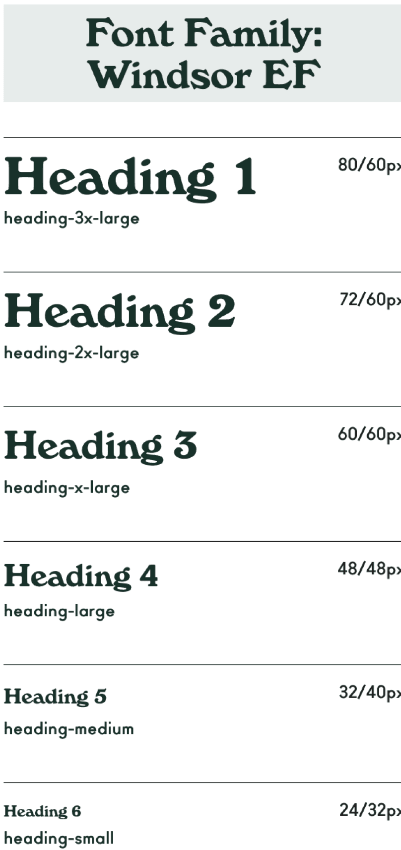
Typography styles.

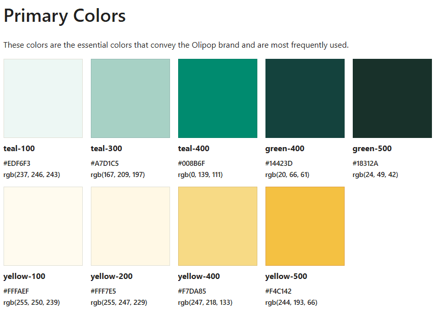
Color Styles.
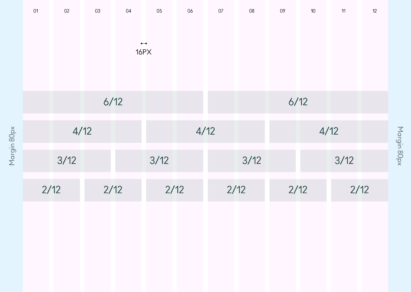
Layout Grid.
Semantic Level Tokens.
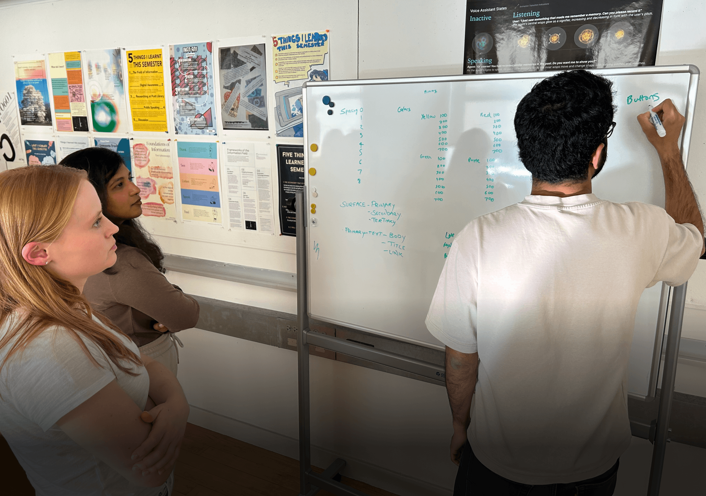
Token nomenclature brainstorming w/ teammates.
BUILDING A SYSTEM // MOLECULES
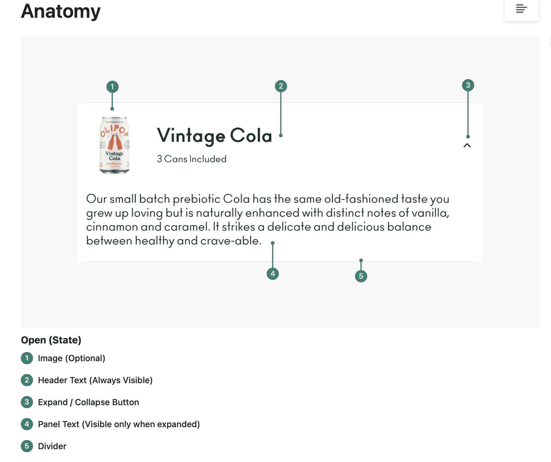
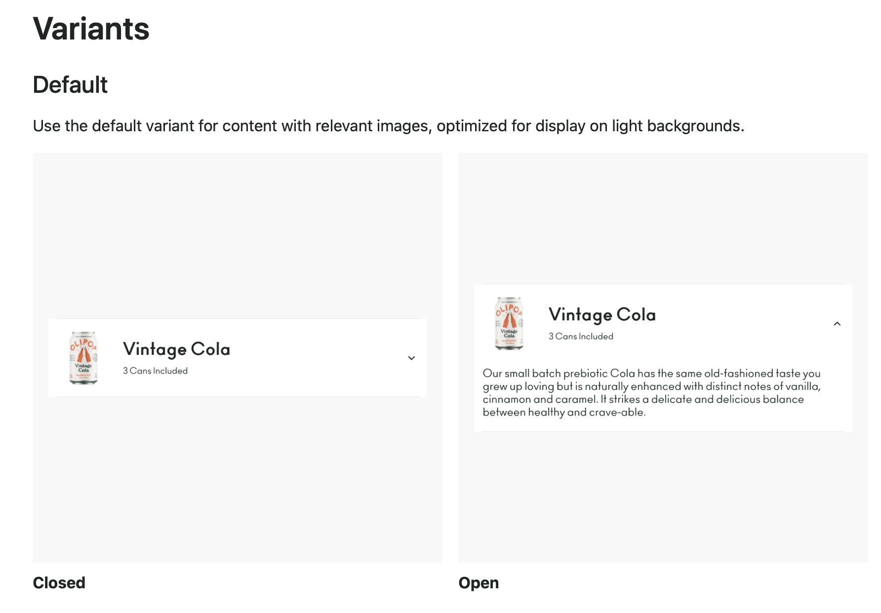
Building flexible and accessible components.
With the established foundations as a base, we built the components that followed our principles. They are designed to be extremely flexible while a special focus is on accessibility too. They come with variants and allow users to tweak properties and swap instances when needed.
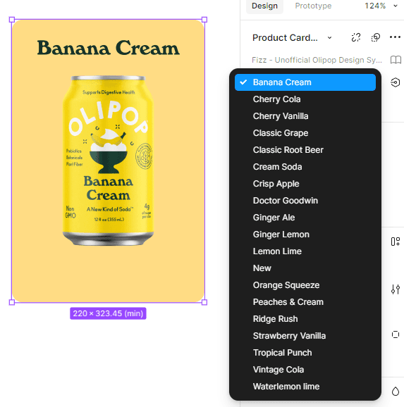
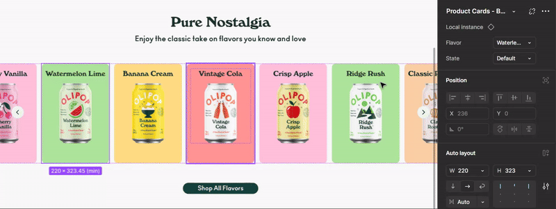
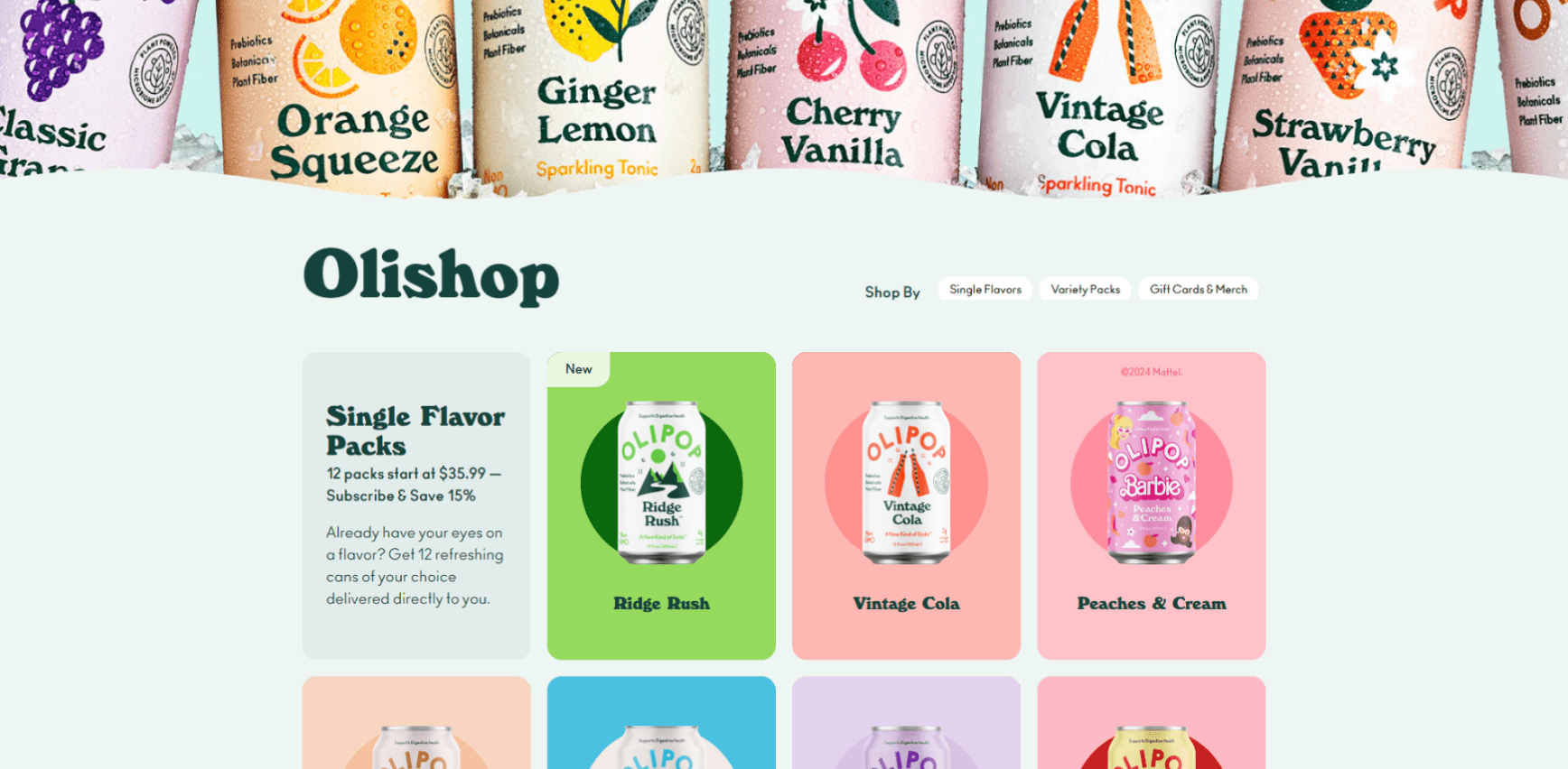
Customizable Cards with variants.
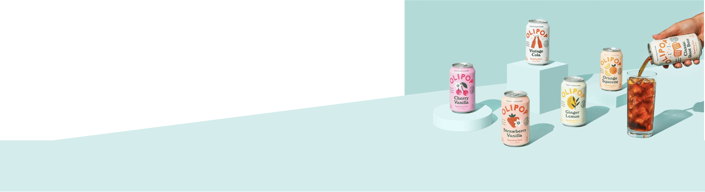
Olipop has a total of 18+ flavors as of date, we condensed the color palette for all the different flavors, introduced tokens for specific flavors and created variants for all the available flavors.
Button
Button
Button
Button

Flexible buttons.
The button are designed with easily swappable/flexible properties, which allows the users to customize the buttons as required.
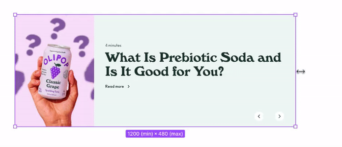
Minimum and maximum sizes.
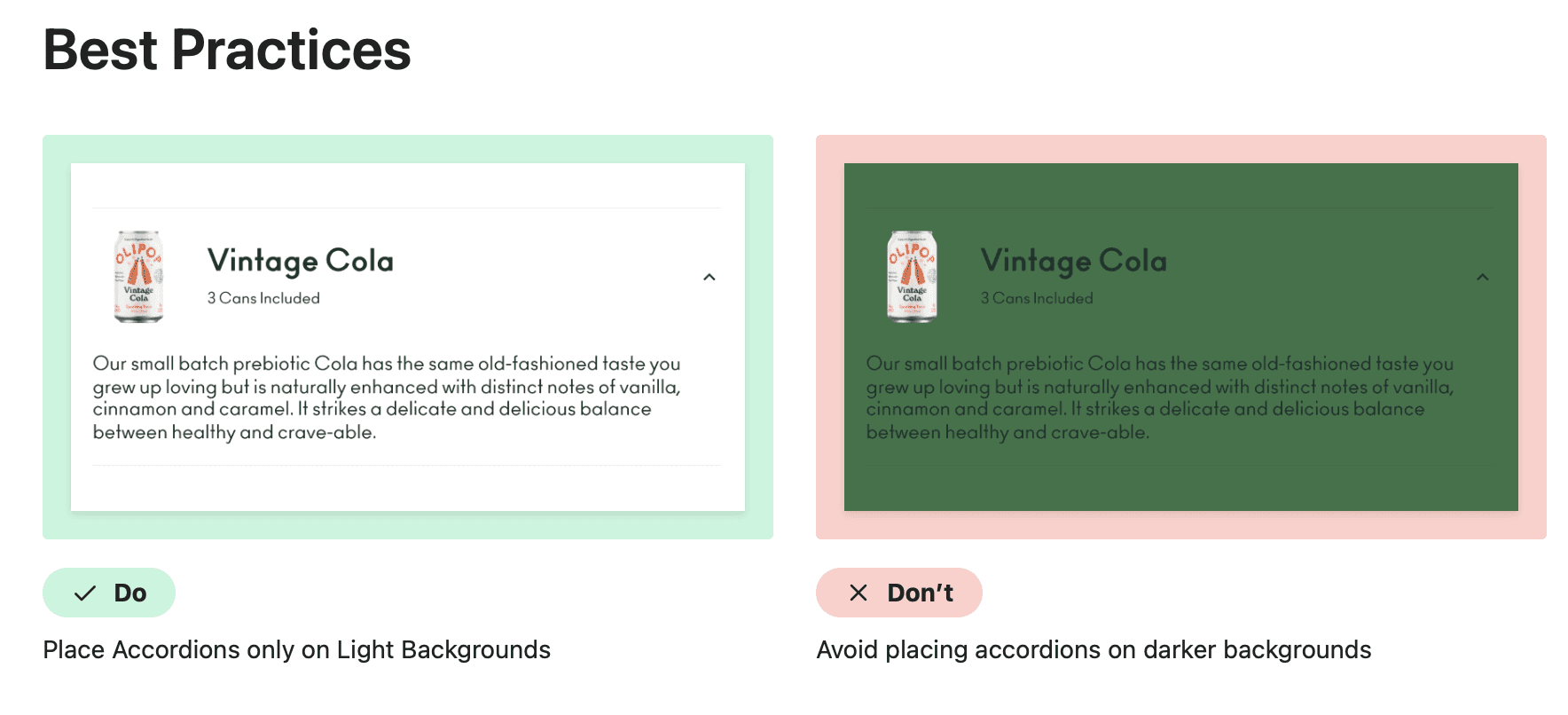
To ensure consistency in sizing, minimum and maximum sizes are set up for all the banners and cards to achieve cohesive layouts.
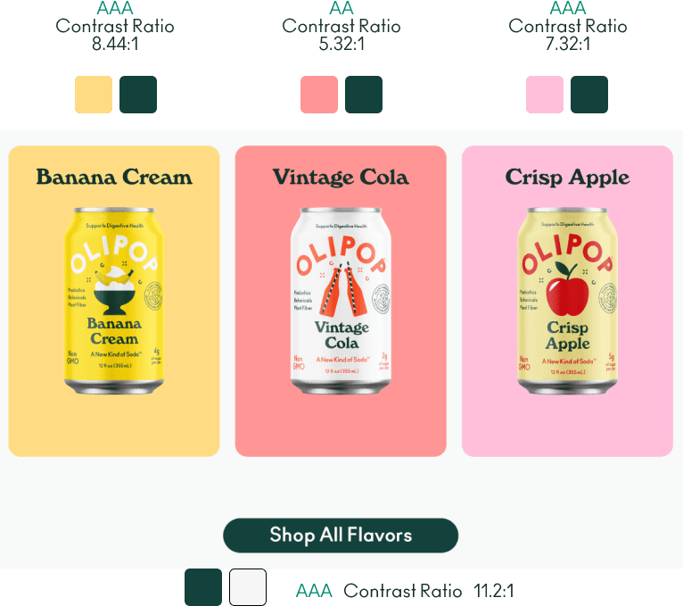
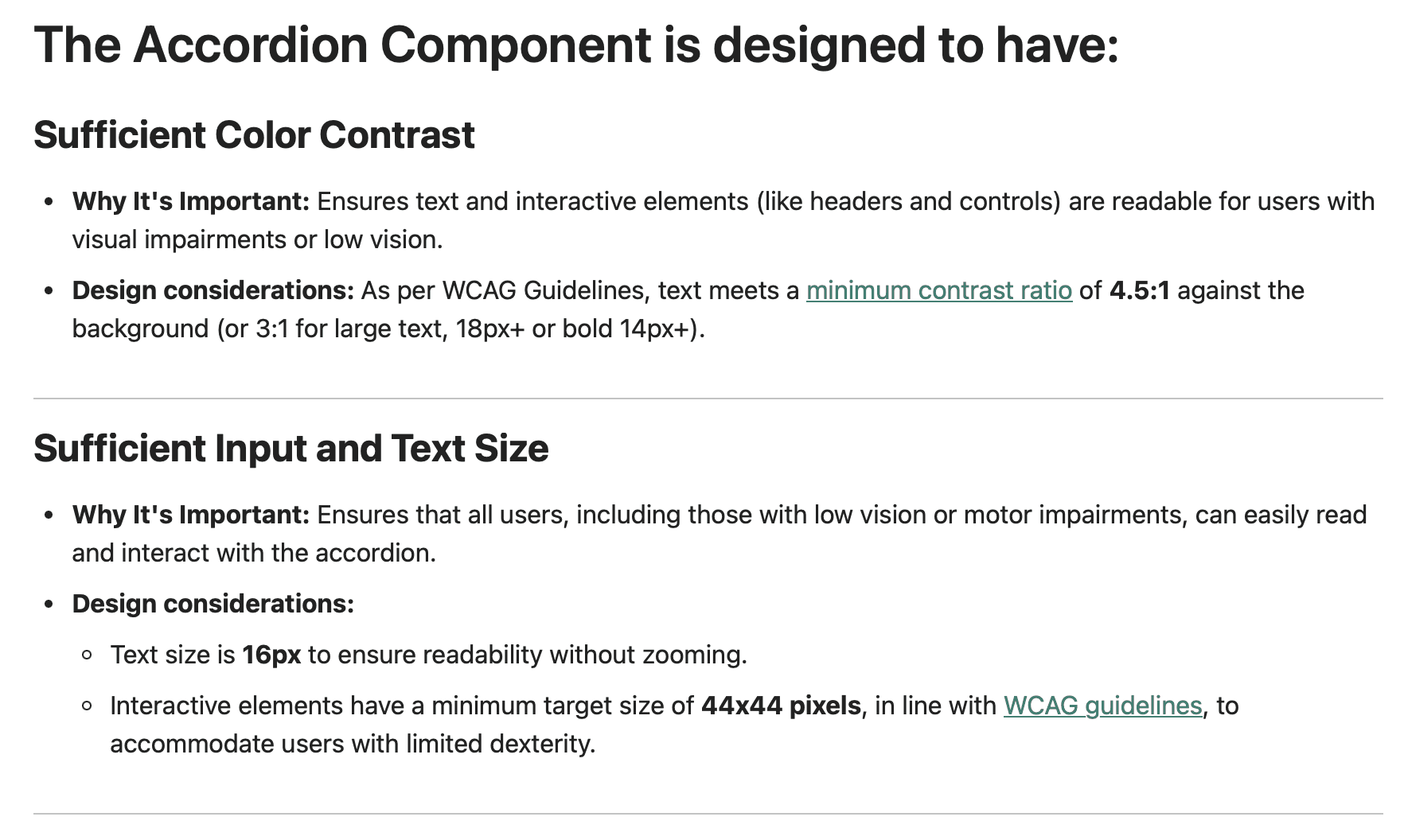
Accessible
All components and sub-components are designed to ensure accessibility.
BUILDING A SYSTEM // ORGANISMS
Creating time-saving patterns.
The commonly repeated page sections are identified and have been built into patterns, inheriting all the properties of components also. This makes them flexible and saves time.
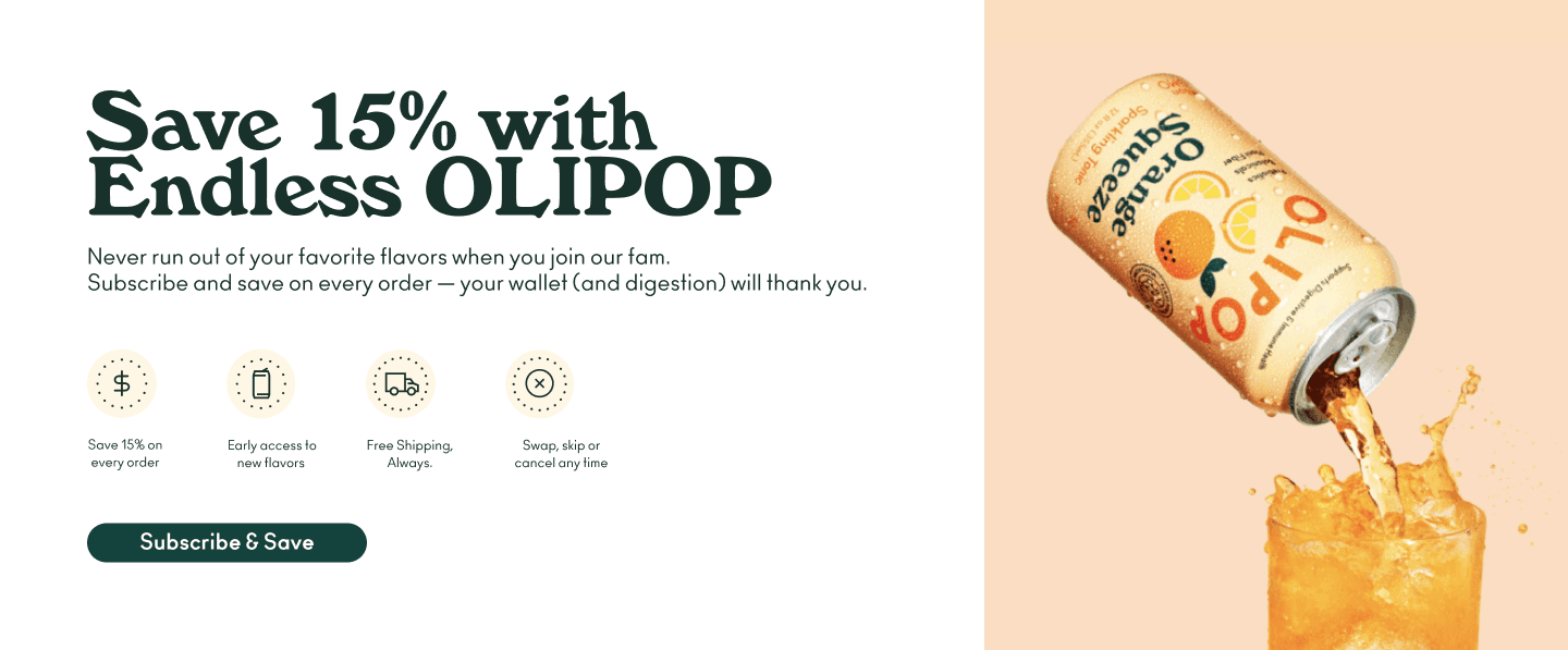
Hero Banner

Banner with icons.
Flexible and customizable patterns.
The commonly repeated page sections are identified and have been built into patterns, inheriting all the properties of components also. This makes them flexible and saves time.
DOCUMENTING A SYSTEM
Documentation:
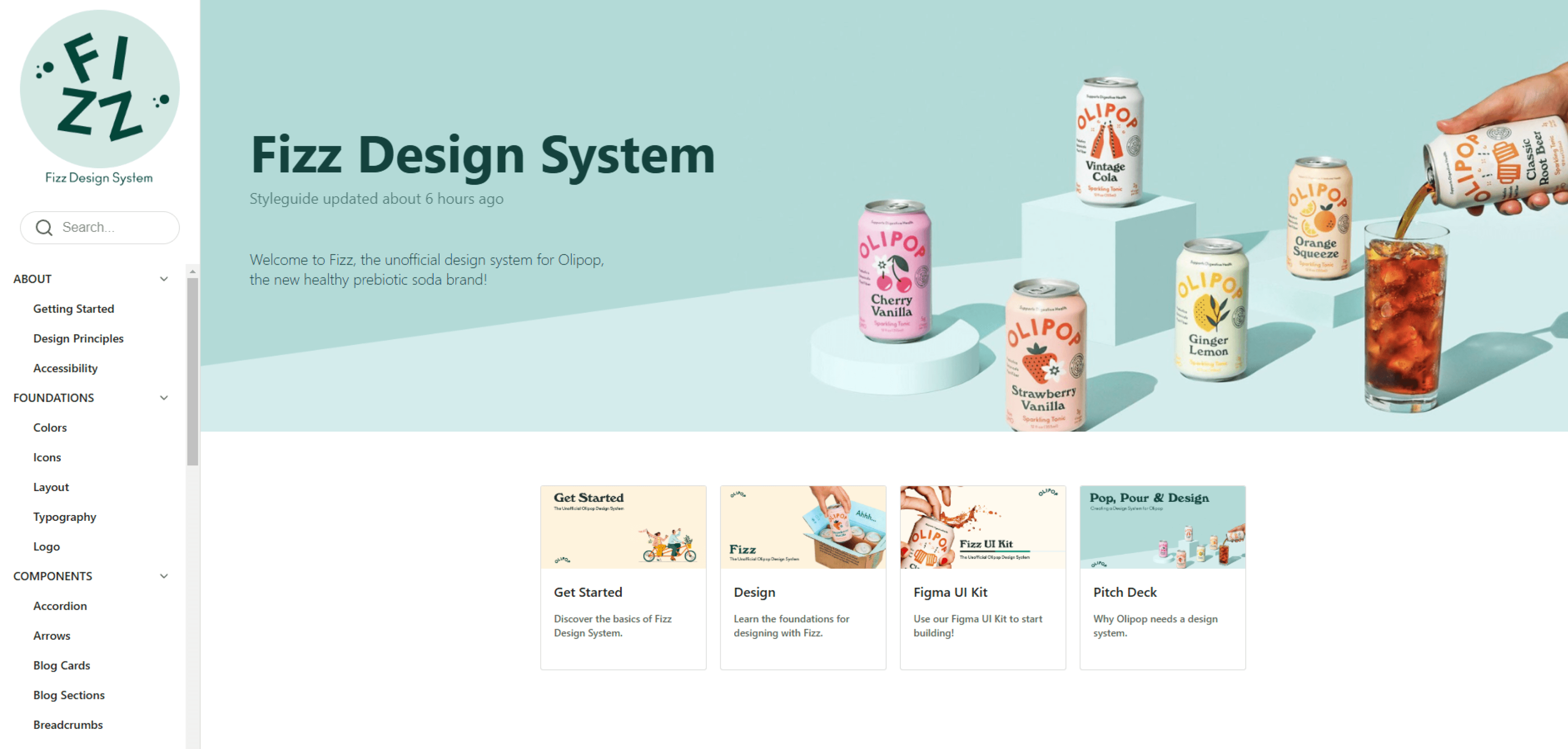
The Fizz Playbook.
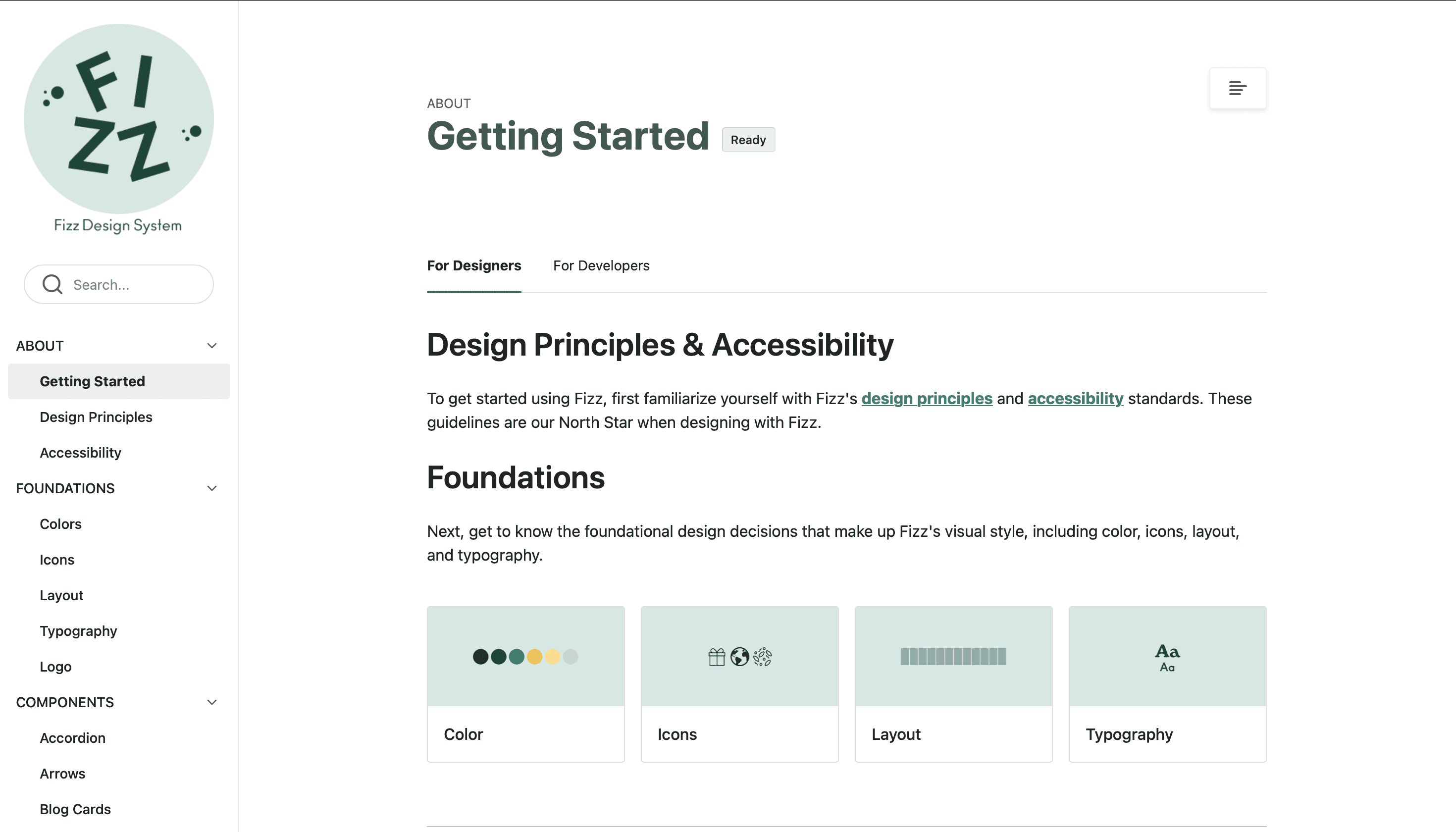
A thorough documentation is provided in ZeroHeight which acts a universal source of truth holding details about the usage guidelines, accessibility, components and variants, support and regulations. It ensures all the users follow the system.
THE RESULTS
Built with Fizz
Fizz Design System is built to simplify workflows and reduce manual labor. This means designers and developers can focus more on creating innovative solutions rather than fixing inconsistencies or redoing work.
The Fizz Toolkit.

Results & Reflection.
Documentation is indispensable.
Creating detailed usage guidelines was the cornerstone of adoption, enabling teams to confidently use the system and build with clarity.
User Testing helps improve the system.
User testing informed our decisions, refining the system to enhance usability and satisfaction. Also provide crucial organization tips.
Design systems promotes usability and cohesion.
By promoting unity across Olipop’s digital ecosystem, we simplified processes and improved the overall user experience.
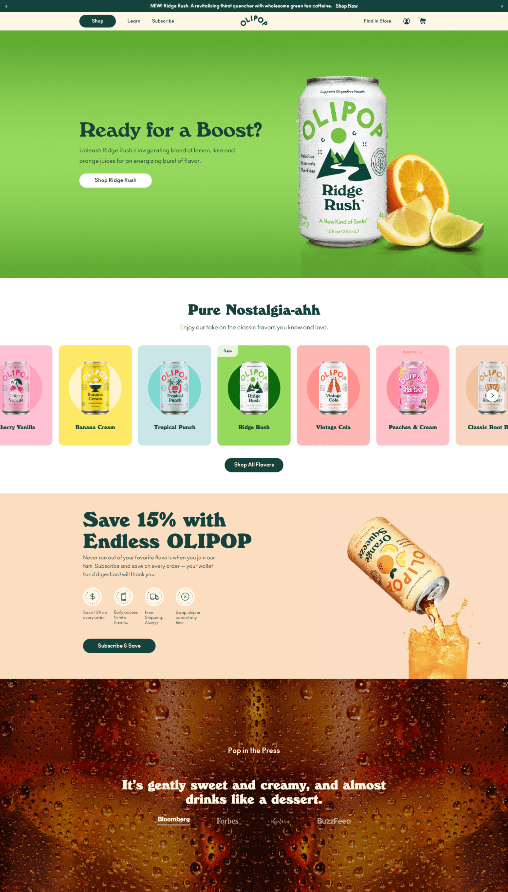
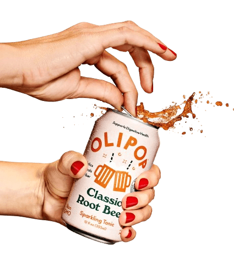
Olipop’s fun digital presence.
Strong and vibrant design identity with bold colors, vibrant creativity and playful interactions.

Creating a Design System
Creating a Design System is about building a set of rules and tools that help designers and developers work together smoothly. It ensures the website looks consistent and works well across different pages and devices.
01
Deconstructing the website.
Analyzing the UI from the structure of the layout to the individual components.
02
Establishing the values.
These values serve as the foundation for all design decisions.
03
Building the system.
Creating reusable components and design patterns that would provide consistency.
04
Documenting the system.
Provides the guidelines for usage and implementation.
OLIPOP
Fizzing Up a Design System.
Creating a design system for Olipop presented a challenge of maintaining the playfulness and the vibrant creativity while building a user-friendly and cohesive experience.
OLIPOP
Brand
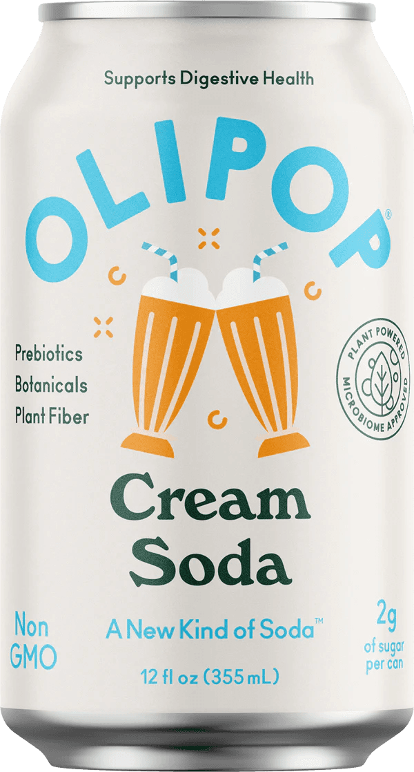
Olipop is a health-focused, prebiotic soda brand that combines bold, refreshing flavors with gut-friendly benefits.

Duration: 14 weeks
September 2024 - December 2024
Design Systems
Details.
Madhumitha Pradeepkumar
Cassandra Cyphers
Shreedhar Verma
The Team.
Created icons for the foundational styles.
Created semantic level tokens for the designed components.
Designed and built accessible and flexible components focused on product grids.
Documented implementation and usage guidelines.
My Role.
Figma.
Google Suite.
Zeroheight - Documentation.
Tools.
OLIPOP
A healthy, pre-biotic soda.
Organizational Principles
User-Centric: Prioritize health, enjoyment, and education about product benefits.
Sustainability & Transparency: Ensure clear information on ingredients, sourcing, and practices.