INDEPENDENT CURATORS INTERNATIONAL
The User Experience Evaluation.
A Comprehensive Analysis & Recommendations.
Our project aimed to thoroughly analyze user experience, pinpoint usability issues, and provide targeted design recommendations for enhancement. Through meticulous research and evaluation, we uncovered insights to optimize user satisfaction and interaction efficiency.
Client
The Details.
My Role.
The Team.
The Tools.
Independent Curators International
Duration: 3 weeks
Usability Theory and Practice.
Figma.
Zoom.
Google Docs.
Google Sheets.
Cathelyna Suherman
Chieh Lei
Madhumitha Pradeepkumar
Nallammai Kannan
Wenjia Liu
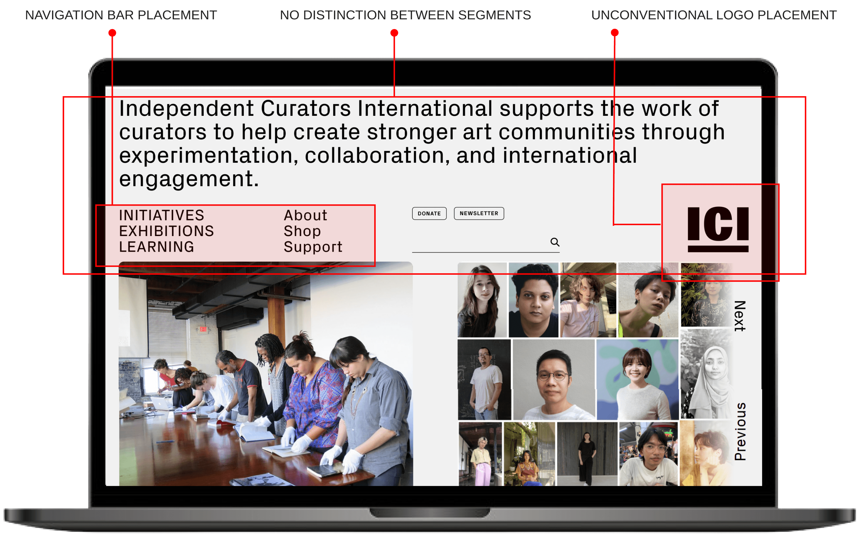
Independent Curators International (ICI) is a non-profit arts organization that supports curators. As ICI is expanding their capacity for content and strategy, they want to further understand their website and content performance.
Identified and reached out to participants for user testing.
Devised the Scenario and Tasks.
Conducted and Moderated Usability Testing.
Analyzed the insights and generated recommendations.
Designed hi-fi wireframes.

a non-profit arts organization
Independent Curators International
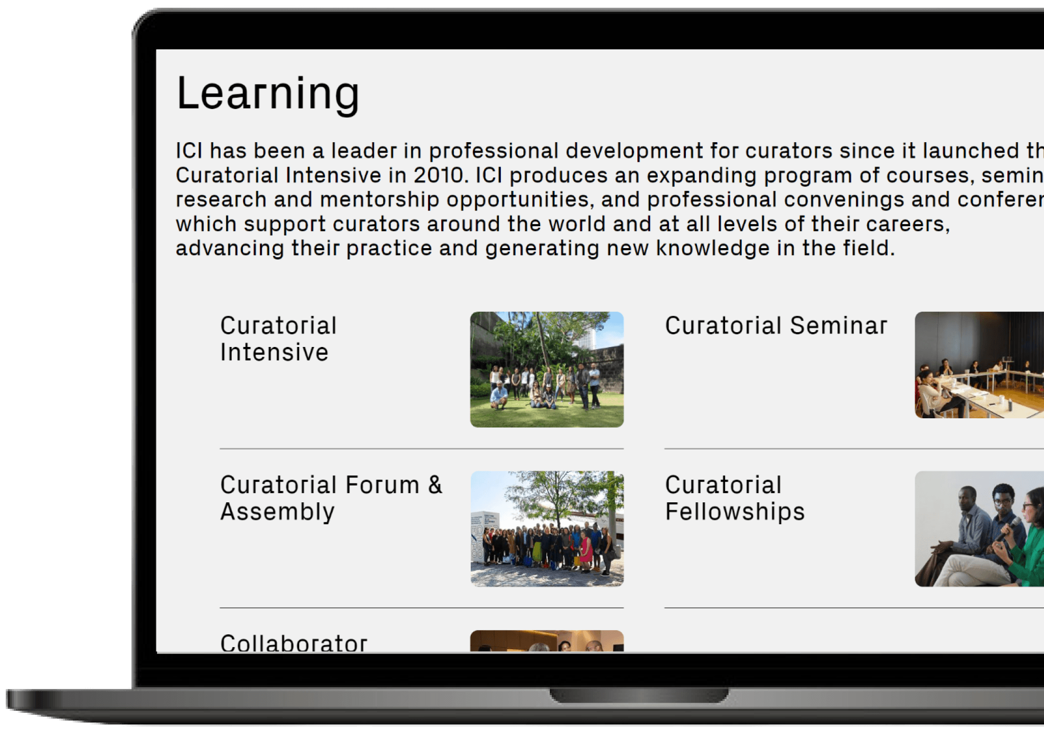
ICI connects curators from across the world and provides many resources, including fellowships, intensives, and seminars. ICI is well-regarded and cherished by its users, and has created a strong community. ICI also has recently reconstructed its website, which is very aesthetically appealing and generally a pleasure to use.
The Deliverables.
Comprehensive Usability Report.
Detailed insights and recommendations derived from our user testing and analysis.
Presentation Deck.
A visually engaging summary of our findings and recommendations, presented to the client.
High-Fidelity Screens.
Professionally designed screens showcasing proposed design recommendations for the ICI website.
The Scope.
01
02
Quantitative and Qualitative Analysis
Content Examination
A deep dive into the substance, tone, and resonance of current material featured on the ICI platform.
To conduct moderated user testing to understand navigation patterns, sentiments, and content evaluation.
The Game-plan.
We employed a comprehensive methodology, starting with a moderated remote user testing approach with diverse participants. This method is widely recognized for identifying usability issues in digital interfaces effectively.
Define.
01
Defining the Target User Group, Scenario, and Tasks.
Moderate.
02
Moderating Tests with Participants to Collect Data.
03
Analyze.
Analyzing Usability Data and Identifying Interface Problems
Recommend.
Providing Recommendations to Address Identified Issues.
04
Establishing and Preparing.
This segment was challenging to get through!
ICI’s requirements were hard to define and come up with tasks for usability testing since they wanted an overall user experience analysis and wanted to know what worked for their site and what didn’t work, and wanted to know where their users tapped on their site. After the initial meeting, though I was excited to work with them, I was a bit confused and intimidated too. It took a lot of brainstorming and communicating back and forth with ICI to ensure we are in the right track.
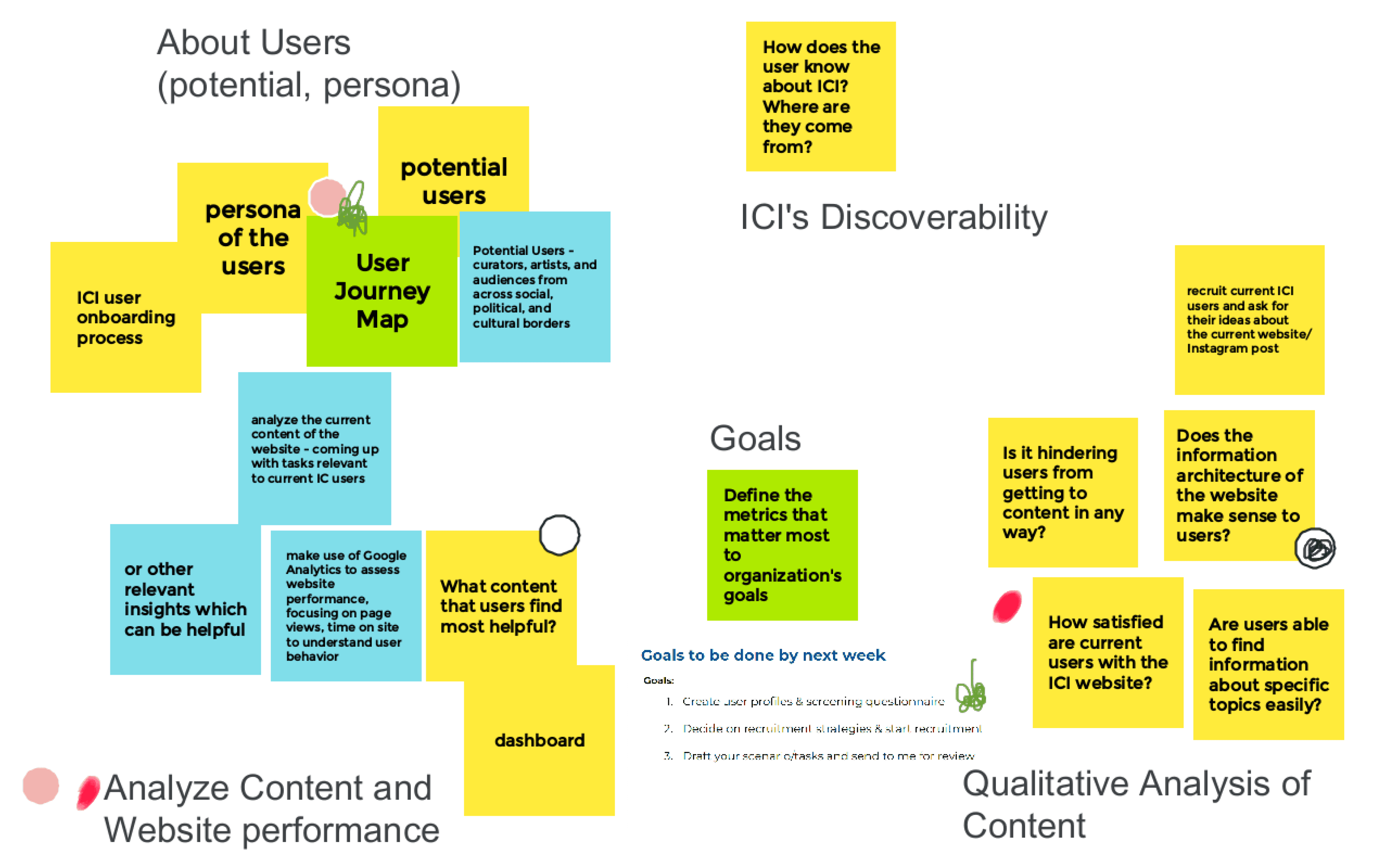
A screenshot of our jamboard after the initial discussion with the client.
The Methodology.
Moderated Remote User Testing.
In this research, we employed remote methods for moderated user testing. This approach is considered the gold standard in usability research, providing a more assured means of identifying usability issues in digital interfaces compared to other research methods such as cognitive walk throughs and heuristic evaluations.
The Scenario & Tasks.
You’re an aspiring curator hoping to broaden your network and discover new programs to grow your skills. You want to utilize the Independent Curators International (ICI) website to assist you in this journey.
01
Find out what professional development programs ICI has for aspiring curators and pick one that interests you the most.
02
Find out the program details.
03
Back on the homepage, find out the most recent exhibition and curator’s information.
04
Find out about one of the ICI’s initiatives that interest you.
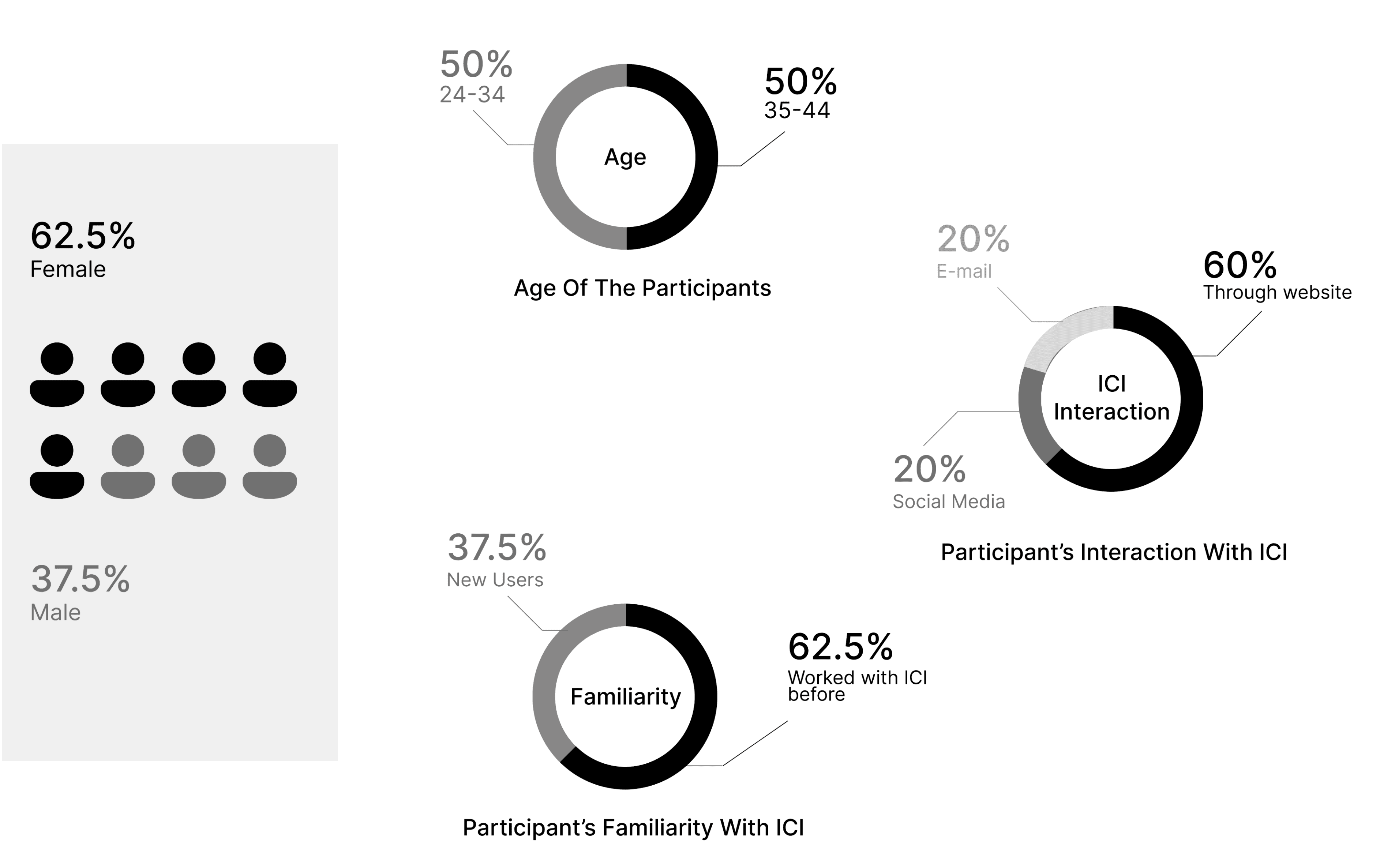
The Participants.
User recruitment was crucial for us!
Moderating the User Testing.
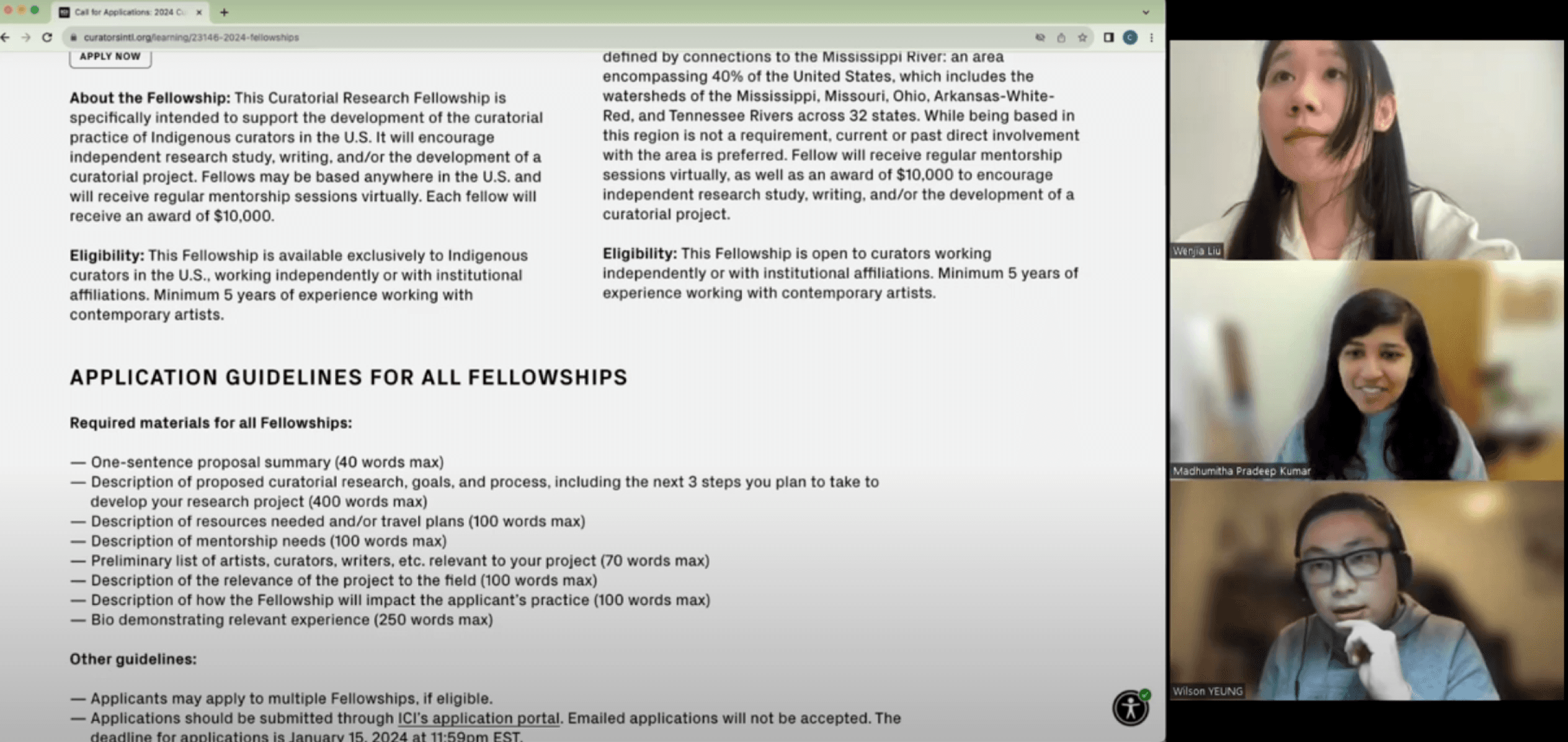

A screenshot my teammate Wenjia and I, conducting the moderated user testing
Analyzing the data.
My teammates and I took turns conducting tests, with one playing the moderator while the other took notes. After testing, we tabulated the results in a spreadsheet to identify patterns and conducted a detailed analysis of both qualitative and quantitative data. We then synthesized the findings to identify recurring patterns and issues across user interactions.
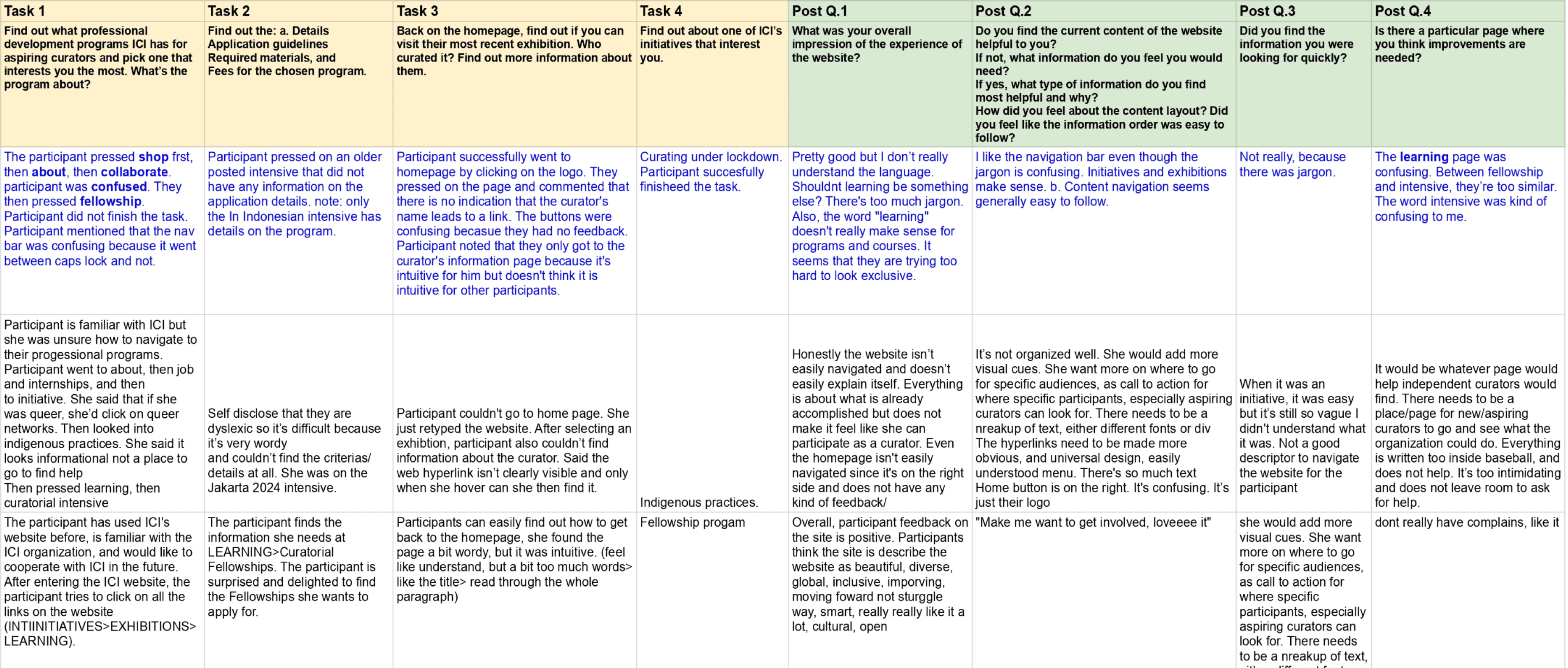
A screenshot of the spreadsheet with tabulated results.
The Findings.
Participants familiar with ICI generally found the website user-friendly and praised its continuous improvement, demonstrating a positive perception.
Website Familiarity
Finding #1
Participants universally appreciated the website's minimalist and clean design, describing it as beautiful, diverse, and culturally engaging.
Aesthetic Appeal
Finding #2
Positive feedback highlighted the website's global and inclusive feel, contributing to a sense of cultural openness and progression.
Global Inclusivity
Finding #3
Areas of Improvement.
We also identified some areas of improvement which when rectified increases the efficiency of the website.
Participants faced challenges in navigating the website, particularly with the jargon in the navigation bar.
Participants faced challenges in navigating the website, particularly with the jargon in the navigation bar.
Lack of visual cues for clickable images led to confusion.
Some participants found the content text-heavy, suggesting the inclusion of summaries or blurbs.
The Navigation Bar.
Application Status Visibility.
Interactive Image Cues.
Content Density and Placement.
Recommendation #01
Reorganizing The Navigation Bar.
Problem: Users cannot clearly understand the contents of the navigation bar
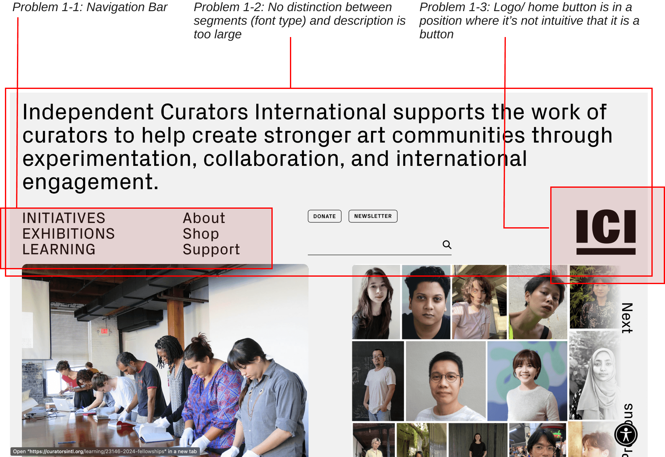
Identified Issues in the navigation bar
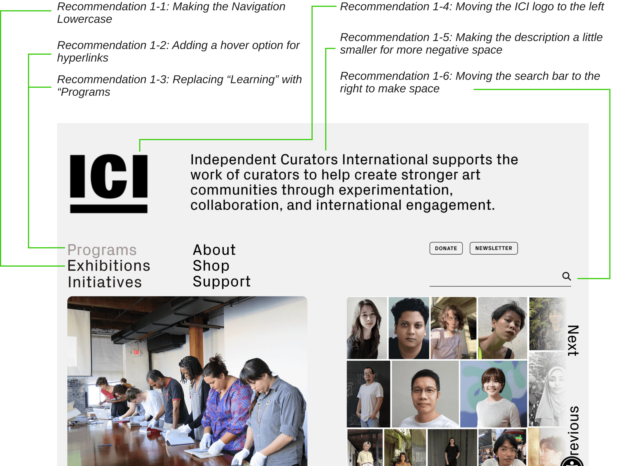
Proposed Recommendation
Recommendation #02
Redesigning Exhibition Information.
Problem: Users cannot identify which exhibits are currently showing.
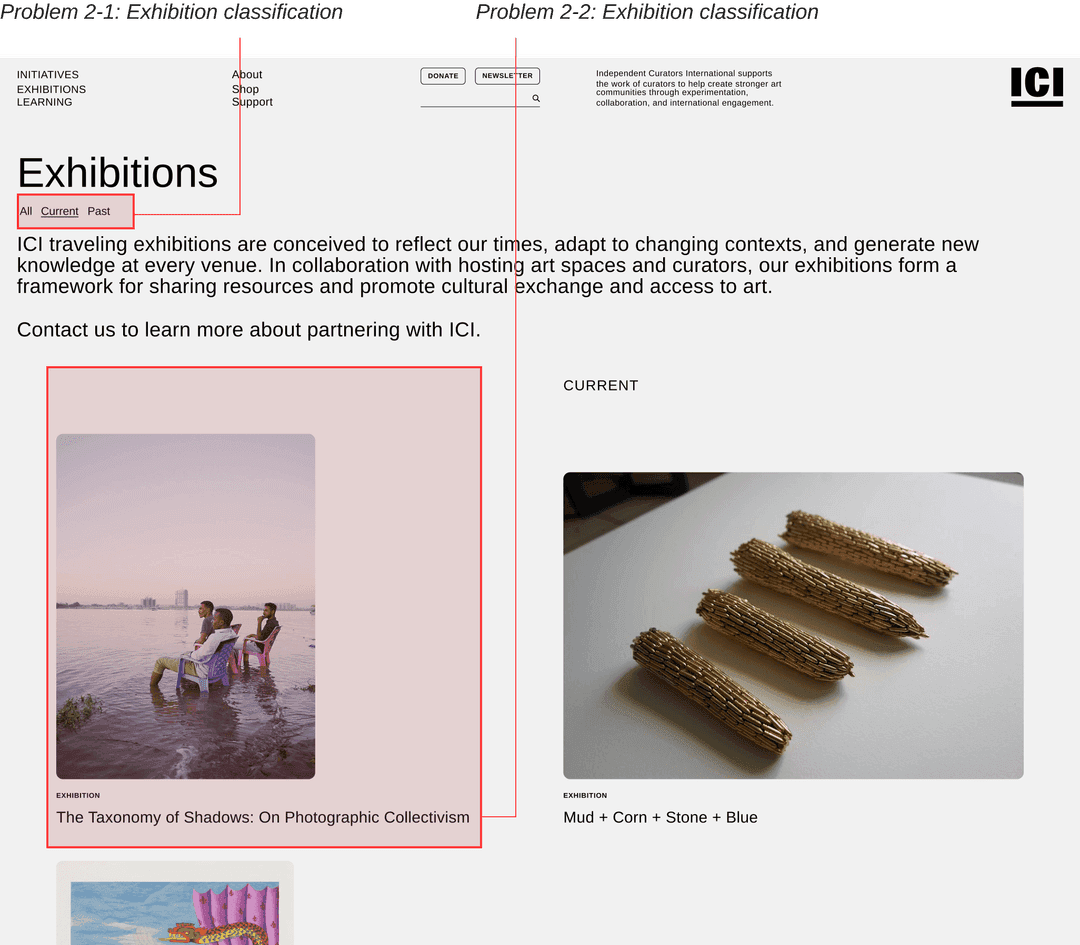
Identified Issues
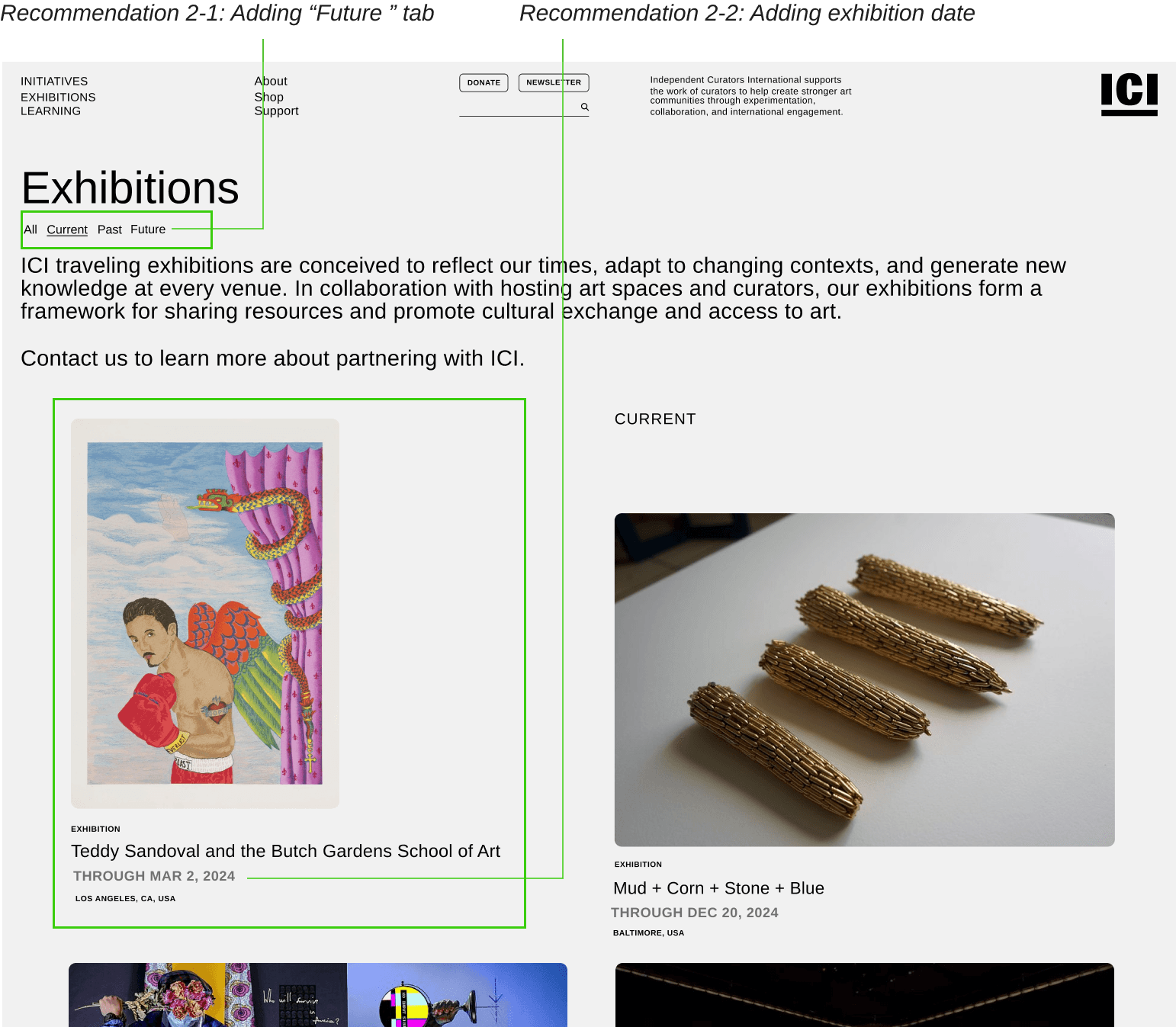
Proposed Recommendation
Recommendation #03
Incorporating Headings and Summaries.
Problem: Users feel content is lengthy and difficult to follow.
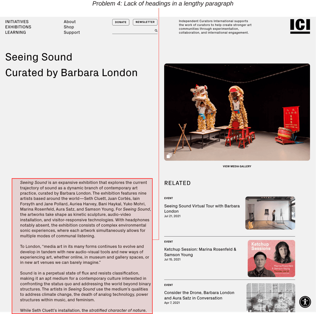
Identified Issues
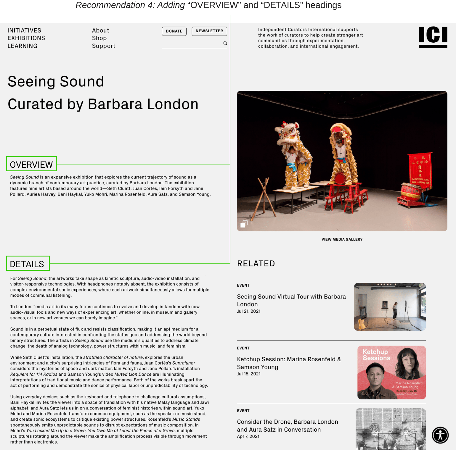
Proposed Recommendation
Recommendation #04
Call to Action for Open Applications.
Problem: Users have difficulty recognizing which opportunities they can immediately apply for.
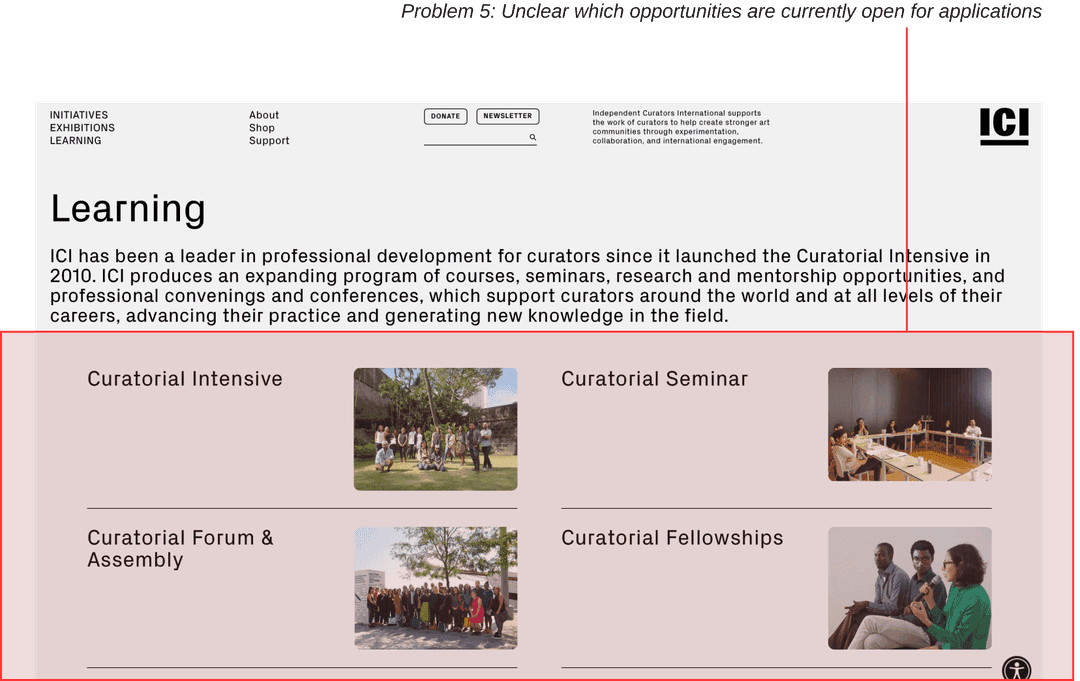
Identified Issues
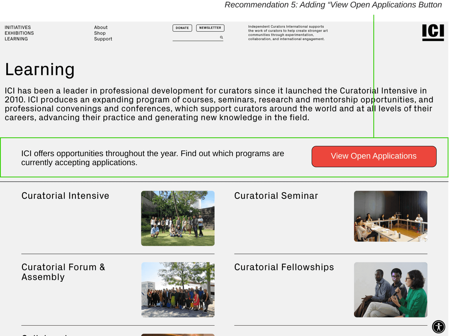
Proposed Recommendation
Results & Reflection
Wrapping it all up!
The client appreciated the number of insights we could derive with a limited user pool and mentioned that they are looking forward to implement the changes!

That’s me!
Happy faces after a successful presentation!
with my teammates.
Taylor Black
The Head of Communications @ ICI
Read Next ->
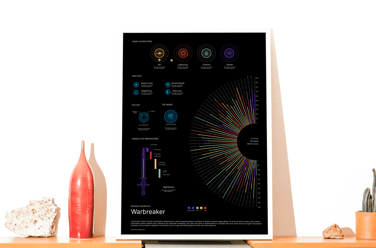
Visualizing a 592 page epic fantasy novel.
Exploring information visualization by breaking down a book in a single poster.
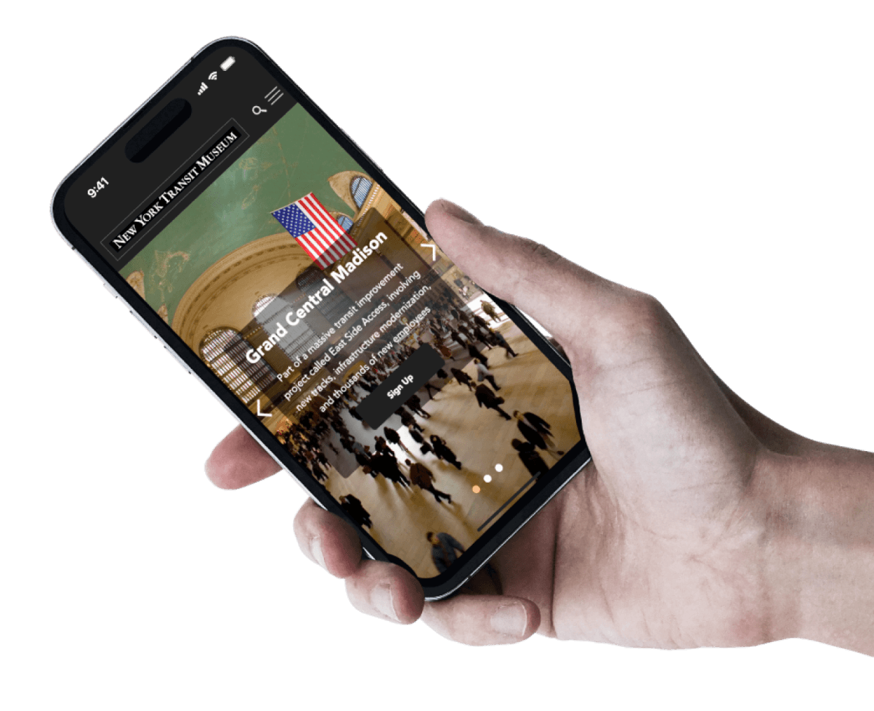
Enhancing New York Transit Museum’s membership flow.
A detailed case study featuring the research to design process of optimizing the membership flow.
